August 8, 201411 yr It's actually ... not bad. The green face mask is awful, but it's not as over the top as I thought it'd be.
August 8, 201411 yr Normally I'd say it's pretty bad, but I suppose considering how teams down south like Seattle, Jacksonville, and Tampa Bay have modified their jerseys, this sort of style is slowly starting to become more popular and I've become more numb to it I guess.. I miss the traditional football jersey though I must say.
August 8, 201411 yr At first, when I had half the screen covered and just saw the helmet, thought it was horrible (maybe a knee jerk reaction to bright green) But overall, I actually think I like it as well. Reminds me a bit of the Oregon Ducks
August 8, 201411 yr I'll say it, if no one else will... it's horrible. FTR: I think there should only be 2 jerseys for each team. Home and away. I don't care if it's tradition that one team is white and the other has colour. Folks with black and white TV's need to get with the times.
August 8, 201411 yr It's different for sure. First glance I liked it, but has way to much bling, hard on the eyes when you really look at it.
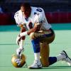
August 8, 201411 yr Here is a better look of the jersey without the photo effects to try and enhance the jersey...quite butt **** ugly now that I've seen this.
August 8, 201411 yr It's all about marketing and selling merch....like it or not there's a few more million in the Sask bank account.
August 8, 201411 yr It's ugly. I'm sure ours is going to be ugly too. Might as well accept it, "ugly" is "in" and has been for awhile.
August 8, 201411 yr It's ugly. I'm sure ours is going to be ugly too. Might as well accept it, "ugly" is "in" and has been for awhile. It really is. If you look at men’s fashion right now it is incredibly gaudy and tacky. Check suit on a check shirt with a paisley tie just isn't outlandish enough, better wear lime green socks and a rainbow pocket square to really add a pop of hideousness.
August 8, 201411 yr These thin mens suits... Most guys can't wear them... You have to be 135 lbs to look good in them. I see the Joseph Abood ads on CFL games & man, they are ugly.... back to the 60's with thin lapels. I blame it all on Ryan Seacrest.
August 8, 201411 yr Kinda makes me go cross eyed staring at the helmet. Looks like a traffic warning sign or something But the colours are okay.
August 8, 201411 yr Is every team going to have the same design with just different colours? I believe they will each be different designs. The black jerseys BC had last year are apparently their version of this release. Who knows why they were released a year early.
August 8, 201411 yr BC's are actually pretty good looking. Sask's though (and if the picture on the game pin is accurate, ours as well) is hideous.
August 8, 201411 yr Supposedly the new jersey is on the Gameday pin vs Montreal. Haven't seen it myself, so I can't say for sure.
August 8, 201411 yr Is every team going to have the same design with just different colours? I believe they will each be different designs. The black jerseys BC had last year are apparently their version of this release. Who knows why they were released a year early. It's spelled R-E-V-E-N-U-E.
August 8, 201411 yr Here is a better look of the jersey without the photo effects to try and enhance the jersey...quite butt **** ugly now that I've seen this. That looks totally different. Blegh. I'm ok with the design *shrug*


It's actually ... not bad. The green face mask is awful, but it's not as over the top as I thought it'd be.