Jump to content

Around The League Off Season Discussion


Recommended Posts

1 minute ago, Mark F said:

 oh well. What do  you think of soccer guys?

I like a bit of excitement in the presentation.

As you said, we all have our preferences.


...is a far cry from "over the top".......

I've worked with, and coached up, several PBP guys over the years. One of the best things I ever heard from a guy was "I try to start the season on a calmer note, and the closer we get to the end of the season, I build it up. In playoffs, I have the most excitement in my delivery of the whole season. If you blow your top early in the year, how can people interpret end of season (playoffs) excitement from you?" And I think that's a really good point. If you're over the top first game of the year through the end of playoffs, you're doing it wrong...

Don't be the entertainment....don't make it about you.....just tell the story, let the game be the focus.

Link to comment
Share on other sites

9 minutes ago, Noeller said:

thanks -- I thought it was one of their old logos....

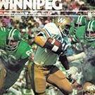
Here's the logo on the side of the helmet during the 1980 season. Joe Barnes is the qb pictured. The Als wore that logo, colours & uniform from 1974-80. In 1974 it was on the back of their helmets. It was moved to the front in 75 & finally to the traditional sides of the helmet in 1976. Or something like that.... Have they gone back to that logo & colours? Or just someone playing on the internet with CFL logos & looks for hockey uniforms?

s-l225.jpg

Edited by SpeedFlex27
Link to comment
Share on other sites

20 minutes ago, SpeedFlex27 said:

Here's the logo on the side of the helmet during the 1980 season. Joe Barnes is the qb pictured. The Als wore that logo, colours & uniform from 1974-80. In 1974 it was on the back of their helmets. It was moved to the front in 75 & finally to the traditional sides of the helmet in 1976. Or something like that.... Have they gone back to that logo & colours? Or just someone playing on the internet with CFL logos & looks for hockey uniforms?

s-l225.jpg

6a00d8341c465d53ef0133f3170d49970b-pi

Link to comment
Share on other sites

26 minutes ago, SpeedFlex27 said:

Here's the logo on the side of the helmet during the 1980 season. Joe Barnes is the qb pictured. The Als wore that logo, colours & uniform from 1974-80. In 1974 it was on the back of their helmets. It was moved to the front in 75 & finally to the traditional sides of the helmet in 1976. Or something like that.... Have they gone back to that logo & colours? Or just someone playing on the internet with CFL logos & looks for hockey uniforms?

s-l225.jpg

Just someone messing around, I think...

Link to comment
Share on other sites

32 minutes ago, Noeller said:

Just someone messing around, I think...

I like those old Als unis & logo. Not that there's anything wrong with the ones they have now. They're pretty decent. The modern Larks logo is actually quite good. The Argos OTOH need to do something. It's an old & dated look. The "Pull Together" logo (shown here) where there were oars coming out of the side of a football was really nice but then they went away from that. The Argos need a reboot.4147857421_53277b367e.jpg


Edited by SpeedFlex27
Link to comment
Share on other sites

18 minutes ago, SpeedFlex27 said:

I like those old Als unis & logo. Not that there's anything wrong with the ones they have now. They're pretty decent. The modern Larks logo is actually quite good. The Argos OTOH need to do something. It's an old & dated look. The "Pull Together" logo (shown here) where there were oars coming out of the side of a football was really nice but then they went away from that. The Argos need a reboot.4147857421_53277b367e.jpg


An oar for each season ticket holder and a spare!  Outstanding design!

Link to comment
Share on other sites

4 hours ago, FrostyWinnipeg said:

1995-2002-1.jpg

Rather liked this one.

We got worst one in league imho. Only made worse by the one from the 90s by a fan. Focking cheap.


Love that Argos logo for sure.


I'm quite happy with ours. There is nothing wrong with simple and basic. Many other teams, pro and NCAA follow the same rule of thumb. 

Link to comment
Share on other sites

17 hours ago, JCon said:

Wouldn't it be nice to see the Moose do a Blue Bomber Jersey night? With the Moose logo and the Bombers colours?

I'm a sucker for this stuff. If unites the city's teams and their fans. Like Bo Levi doing a bunch of Flames promo the last few days.

As far as I know Pittsburgh is the only city whose teams all wear the same colour. That's pretty cool.

Link to comment
Share on other sites

Guest
This topic is now closed to further replies.
×
×
  • Create New...