Jump to content
View in the app

A better way to browse. Learn more.

Morning Big Blue

A full-screen app on your home screen with push notifications, badges and more.

To install this app on iOS and iPadOS
  1. Tap the Share icon in Safari
  2. Scroll the menu and tap Add to Home Screen.
  3. Tap Add in the top-right corner.
To install this app on Android
  1. Tap the 3-dot menu (⋮) in the top-right corner of the browser.
  2. Tap Add to Home screen or Install app.
  3. Confirm by tapping Install.

A couple seasons to digest: Our new unis

Let me preface this by saying I enjoy nostalgia. I think a lot of the jerseys in the 80's were amazing, and the 90's ruined everything. We've had a couple years now with our new uniforms and I have to say I'm amazed at how bad they are in comparison to previous jerseys. Simple question: Do you like the new duds now with some time under them, or, do you long for the 90's or 80's jerseys? Or something new?


Doug-Brown-Winnipeg-Blue-Bombers-2003.jpDunigan.Matt-Wpg6.jpg

crop_20069653203.jpg

  • Replies 60
  • Views 8.4k
  • Created
  • Last Reply

Top Posters In This Topic

Most Popular Posts

  • The new jerseys are disgusting. They completely overthought the process and should've followed suit with the whole "old is new again" thing that has taken over recently.   Classic, simple, clean. Th

  • Retro 80's for the big fat win.   Mods, you can lock the thread now

  • Is this discussion really happening right now?

Do you like our new jerseys? 45 members have voted

  1. 1. Do you like our new jerseys?

    • Yes
      5
    • No
      7
    • Dear god why couldn't we just have the beautiful 80's jerseys??
      33

Please sign in or register to vote in this poll.

Featured Replies

New jerseys suck and are synonymous with one of the worst periods in Bomber history. 

The new jerseys are disgusting. They completely overthought the process and should've followed suit with the whole "old is new again" thing that has taken over recently.


Classic, simple, clean. That's how they should have went with it. The current product looks like what happens when a designer gets angry after you take his glue gun and bedazzling kit away. Too many lines, colored trims and other nonsense just for the sake of being new.


Home jersey - royal blue, white numbers, gold trim.

Away jersey - white, royal blue numbers, gold trim.

In layman's terms, this is the new Bomber jersey ...


dancefatty.gif

In layman's terms, this is the new Bomber jersey ...


dancefatty.gif


Please restrict your use of the internet for sports related products. Please.


In layman's terms, this is the new Bomber jersey ...


dancefatty.gif


Please restrict your use of the internet for sports related products. Please.


What's seen cannot be unseen?

But remember, those jerseys were designed after extensive fan consultation.  That's what the fans said they wanted.  


Allow me to now show my age and lack of creativity by dropping a Dr. Evil "riiiiiiiight."  

  • Author

But remember, those jerseys were designed after extensive fan consultation.  That's what the fans said they wanted.  


Allow me to now show my age and lack of creativity by dropping a Dr. Evil "riiiiiiiight."  


Did someone at the BB org actually have the stones to say this? Im pretty sure our 3rd jersey royal blues are selling more than the garbage home and away.


Oh and speaking of away... we literally have the worst away jerseys in North America.


But remember, those jerseys were designed after extensive fan consultation.  That's what the fans said they wanted.  


Allow me to now show my age and lack of creativity by dropping a Dr. Evil "riiiiiiiight."  


Did someone at the BB org actually have the stones to say this? Im pretty sure our 3rd jersey royal blues are selling more than the garbage home and away.


Oh and speaking of away... we literally have the worst away jerseys in North America?


Try the world, even worse than some of those putrid WLAF unis in the 90's :(

They switched to the gold away jerseys for marketing reasons. Nobody wanted to buy the white road jerseys.

While I still far prefer the royal blues, I don't really hate the uniforms as much now. I actually really like our away ones. The home ones are still meh. They overdid it and so it looks weird. Because of the design, they also look terrible when fans wear them. Shoulder pads are needed for it to look decent. If not you end up with trim for the shoulders down on the fans' arms.

I agree with Mike. Old is new again... Who says fans won't buy the away retro whites? They'll buy them if the Bombers wear them & they are on the rack. The regular home & away unis suck.

They suck, I wish we would go with the royal blue jerseys full time.

I don't mind them myself .. a little busy but they aren't terrible .. prefer the Royal blue jerseys though

I don't mind our uniforms because the colours Blue and Gold signify the colours of this team, the Blue Bombers.

The different styles throughout the years will always invoke a difference of opinion.

I love those colours and much prefer them to many, many (if not all) uniform colours.

Now that we're going to be turning things around in Bomberland, I want the players to be wearing those colours proudly.

And that's what I really care about.


Don't mind solid golds as a 3rd jersey, the ones we wore in the 07 Grey Cup, but hate the current gold road jerseys.  Home jerseys aren't bad.

In the NFL, the Jets went back to their old look as did the 49ers with some subtle changes such as the logo on the helmets being slightly different as well as a deeper gold for the pants & smaller striping. Being a 49ers fan & having some gear as well as spending time in the Bay Area with some fans I know, the Niners fans love the old look better than what they had before. It evokes the Glory Years  of the 80's with Joe Montana, Jerry Rice & Ronnie Lott for all of them. We need to go to that old look as well. The third unis are great & the old road unis from the 80's would look outstanding as well. It seems to be what fans want but the Bombers just don't listen.

The thing I hate even more the colour schemes is the heavy material they're made from. Loves the light, airy unis we've had up till this point. Even the royal blues they came out with last year aren't as nice as the royal blues from a couple years ago, because of the heavyness of the material.

Yeah the New Jersey style is awful the don't fit nicely like the old ones.

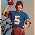
The royal blues are small. I usually take an  XL or a 2XL. I tried on the new Bomber third jersey last fall & I fit into a 4XL. The #5 Dieter Brock jersey I have from 2010 is a 2XL &  it fits really well. Not too big or too snug. I have no idea why Reebok is messing with the sizes they way they do. The staff at the Bomber Store told me the sizes for the jerseys now are smaller as they are designed & cut differently. Most fans aren't shaped like athletes & want to wear a   jersey over a jacket, shirt or hoodie so Reebok is really stupid to go to a snug design for retail sales.

The royal blues are small. I usually take an XL or a 2XL.... I tried on the new Bomber third jersey last fall & I fit into a 3XL. The #5 Dieter Brock jersey I have from 2010 is an XL & it still fits really well. Not too big or too snug. I have no idea why Reebok is messing with the sizes they way they do. The staff at the Bomber Store told me the sizes for the jerseys now are smaller. Most fans are out of shape & want to wear a jersey over a jacket, shirt or hoodie so Reebok is really stupid to go to a snug design for retail sales.

Most fans are out of shape??? Not sure I'd agree with that.


he's trying to make himself feel better...but let's not turn this into another thread with a bunch of Delta Bravo's talking about their reps....*fart noise*

Feel better, for what? So, both you guys think that the majority of fans aren't out of shape. LOL!! Which universe do you both dwell guys n? ;)

I'm 52 and still fit my 32 jeans. I play hockey once or twice a week and try to keep active. That being said, I would agree that the majority of fans are out of shape and prolly need the larger fit jersey. Except for those with health or mobility issues, agreeing with that does not endorse the excuse for the lifestyle of inacitivty or obesity however :)

In layman's terms, this is the new Bomber jersey ...


dancefatty.gif


colin pls stahp.

Create an account or sign in to comment

Account

Navigation

Search

Configure browser push notifications

Chrome (Android)
  1. Tap the lock icon next to the address bar.
  2. Tap Permissions → Notifications.
  3. Adjust your preference.
Chrome (Desktop)
  1. Click the padlock icon in the address bar.
  2. Select Site settings.
  3. Find Notifications and adjust your preference.