August 8, 201411 yr It's actually ... not bad. The green face mask is awful, but it's not as over the top as I thought it'd be.
August 10, 201411 yr Based on the sneak peeks I have seen, this was a quick sketch up of how the Argos jerseys may look. Tennessee Titans?
August 10, 201411 yr Here is a better look of the jersey without the photo effects to try and enhance the jersey...quite butt **** ugly now that I've seen this. I CANNOT BELIEVE THEY KEPT THE TRAMP STAMP.... is Sask really that trashy???
August 10, 201411 yr Is every team going to have the same design with just different colours? I believe they will each be different designs. The black jerseys BC had last year are apparently their version of this release. Who knows why they were released a year early. These aren't bad.... if we did something similar to this... featuring royal blue (even navy blue would be ok) with gold outlined numbers and a gold W on the shoulder.... I'd be happy with that, I'd even consider buying one...
August 10, 201411 yr Is every team going to have the same design with just different colours? I believe they will each be different designs. The black jerseys BC had last year are apparently their version of this release. Who knows why they were released a year early. These aren't bad.... if we did something similar to this... featuring royal blue (even navy blue would be ok) with gold outlined numbers and a gold W on the shoulder.... I'd be happy with that, I'd even consider buying one... We already did that. See 2007 Grey Cup.
August 11, 201411 yr Author If Toronto (or Winnipeg, since apparently that's a possibility as well) goes with the logo on the front and the numbers on the shoulder ... well, I'll laugh my ass off.
August 11, 201411 yr If Toronto (or Winnipeg, since apparently that's a possibility as well) goes with the logo on the front and the numbers on the shoulder ... well, I'll laugh my ass off. Why? Because it's different?
August 11, 201411 yr That was already tried in 1995 with the US expansion teams. Memphis, Birmingham & even the Argos had logos on the front. Universally it was panned as being ugly & compared to hockey jerseys. It lasted one season. here is the Memphis Mad Dogs home jersey: http://gamewornfootballjersey.com/image/79971218_scaled_618x485.jpg
August 11, 201411 yr Author If Toronto (or Winnipeg, since apparently that's a possibility as well) goes with the logo on the front and the numbers on the shoulder ... well, I'll laugh my ass off.Why? Because it's different? Because I think it will look ridiculous.
August 11, 201411 yr If Toronto (or Winnipeg, since apparently that's a possibility as well) goes with the logo on the front and the numbers on the shoulder ... well, I'll laugh my ass off. And I doubt you would be the only one as well..
August 11, 201411 yr If Toronto (or Winnipeg, since apparently that's a possibility as well) goes with the logo on the front and the numbers on the shoulder ... well, I'll laugh my ass off.Why? Because it's different? Because I think it will look ridiculous. I have a feeling you will be strongly disappointed in these then.
August 11, 201411 yr Wondering why the blue pants...this is the part that confuses me the most about these outfits.
August 11, 201411 yr Wondering why the blue pants...this is the part that confuses me the most about these outfits. You mean, you don't understand the part where the Stampeders are the real redblacks? The Ottawa redblacks are really the whiteblacks on the road & mostly black at home. From what I'm hearing here & elsewhere, the Bombers who are traditionally Blue & Gold are just two shades of blue like the Double Blue in Toronto. Yeah, I don't get it either...
August 11, 201411 yr Is every team going to have the same design with just different colours? I believe they will each be different designs. The black jerseys BC had last year are apparently their version of this release. Who knows why they were released a year early. These aren't bad.... if we did something similar to this... featuring royal blue (even navy blue would be ok) with gold outlined numbers and a gold W on the shoulder.... I'd be happy with that, I'd even consider buying one... We already did that. See 2007 Grey Cup. What? 2007 Grey Cup we wore the Gold 50s (or 60s I forget) retro jersey.... not even remotely close to what I was suggesting.... but FTR I do really like those jerseys too...
August 11, 201411 yr Those golds weren't a retro...they were just golds that were done up. The 50s retros were a dark navy blue (I have a Khari one)...the 60s retros were the whites...(I have a Walby one)...and the 70s were the Royals that we all love the most (I got a Joe Pop and Doug Brown one, 'cause they're so damn awesome)....and the 80s ones are the new-ish Royals that were done up last year...(just grabbed a Dunigan one of those...)
August 11, 201411 yr Johnny Sears Jr @JJr0 4m I don't know what that is but I'll be ashamed to wear it! Wonder if this is in response to the Signature Jersey.
August 11, 201411 yr Those golds weren't a retro...they were just golds that were done up. The 50s retros were a dark navy blue (I have a Khari one)...the 60s retros were the whites...(I have a Walby one)...and the 70s were the Royals that we all love the most (I got a Joe Pop and Doug Brown one, 'cause they're so damn awesome)....and the 80s ones are the new-ish Royals that were done up last year...(just grabbed a Dunigan one of those...) I think you're right,... but nevertheless, that gold jersey is nothing near what I was describing in the previous post
August 11, 201411 yr @JJr0: I don't know what that is but I'll be ashamed to wear it! @JJr0: I don't know what that is but I'll be ashamed to wear it! Focus more of your energy on staying healthy long enough to have a chance to wear it JJr0.
August 11, 201411 yr Some will probably like it, most won't. Whatever, let's just hope we only see it once or twice and then it's burned... could always use some bomber cleaning rags around the house so maybe at the year end clearance sale, i'll pick a few up for 2 bucks.
August 11, 201411 yr Johnny Sears Jr @JJr0 4m I don't know what that is but I'll be ashamed to wear it! Wonder if this is in response to the Signature Jersey. One would assume not as he is undoubtedly going to have a chance to wear ours.. No? Seems against what O'Shea would be preaching about unity and the team, etc etc.. Unless it's insanely hideous... Imma assume it's about the mountain dew soccer Jersey lol
August 11, 201411 yr The mid-2000s golds are probably our best 3rd jerseys. Could have just given those some kind of weird glossy finish and called it new.
August 11, 201411 yr The mid-2000s golds are probably our best 3rd jerseys, after all the royal blues. Could have just given those some kind of weird glossy finish and called it new.fyp.
August 12, 201411 yr The mid-2000s golds are probably our best 3rd jerseys. Could have just given those some kind of weird glossy finish and called it new. What I liked best about those jerseys was their simplicity.... Gold jersey with Blue numbers, blue W, blue letters and blue pants.... perfect.... The new jerseys just have too many much going on in the shoulders area with the blue/gold/white combo... then random blue/gold stripes running horizontally..... and some kind of stripe/bolt on the pants... too much going on...

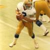
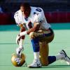


It's actually ... not bad. The green face mask is awful, but it's not as over the top as I thought it'd be.